feature | MR CUP letterpress calendar 2020

I’m writing today with BIG news… my work is being featured in one of my favorite print projects of all time: the annual Mr Cup Letterpress Calendar! I’ve been purchasing this calendar on Kickstarter since 2015, and if you follow me on Instagram, you may have seen me post a flat lay here and there of some of my favorite pages. I honestly never dreamed of being a PART of the calendar, but I am here to tell you that anything is possible when you’re truly passionate about it. :)
ABOUT MY DESIGN
What you see above is actually the second concept I came up with for the calendar, the first being more graphic/illustration-focused with a completely different theme. When initially brainstorming ideas for a classic story that centered on feelings (and how others make us feel), I couldn’t get the Ugly Duckling out of my head. I spent hours working out the feather details of a swan, but every time I looked at it, it didn’t make me FEEL anything. This one—the floral one—does.
I’m still wrestling with the fact that there’s nothing NEW or daring or different about hand drawn florals, but there’s no denying that they spark joy for me. In fact, one of my favorite memories is when my dad sent flowers to my desk at The Getty on Valentine’s Day in 2008. I’m 90% sure I was still in a relationship at that point, and it was dear ol’ Dad who made me feel the most special day.
After deciding on the new concept, my goal was to arrange a “loose bouquet” that was asymmetrical yet balanced. I wanted strong, organic lines and open spaces that would highlight the texture of letterpress, with tiny spots of overlap to give it dimension. As one of only a handful of female designers to contribute to the calendar, my hope is that this speaks to other women in some way, perhaps by conjuring up some good memories or inspiring them not to be afraid of doing what makes them happy.
I’ll be sure to show you my original design on Insta later, but for now, I’d like to share some of my favorite designs from previous editions:
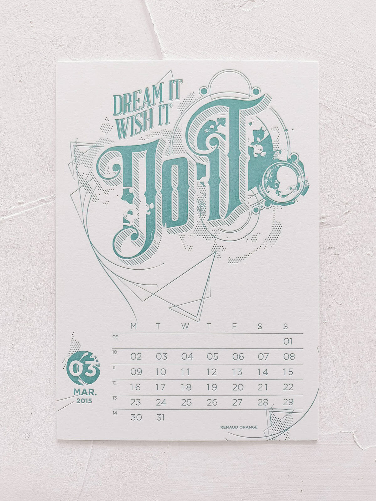
MR CUP LETTERPRESS CALENDAR / ARTWORK BY Renaud Orange
I love how imaginative this one is… It’s something I never would have been able to come up with on my own.
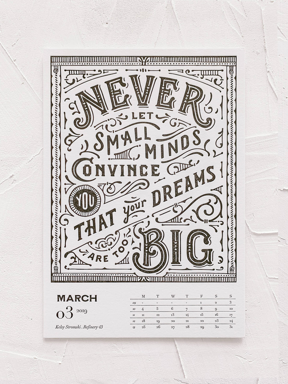
MR CUP LETTERPRESS CALENDAR / ARTWORK BY REFINERY 43
Kelsy is an incredibly talented designer and letterer, and I’m in awe of the balance in this one.
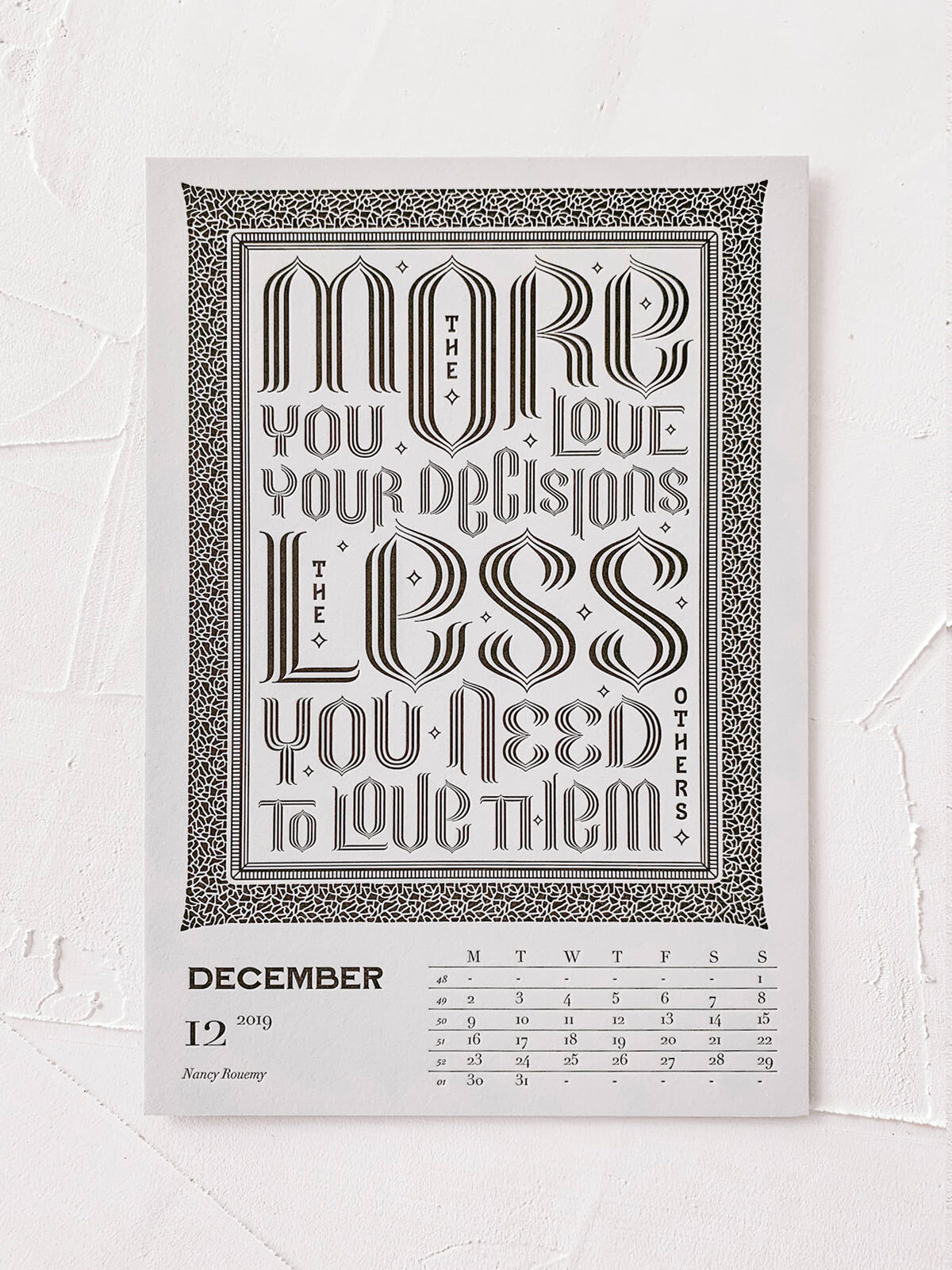
MR CUP LETTERPRESS CALENDAR / ARTWORK BY NANCY ROUEMY
Here’s another example of a style that’s SO different from mine but I love nonetheless. All the heart eyes for that patterned border!

MR CUP LETTERPRESS CALENDAR / ARTWORK BY 1924.US
My favorite part? The shackles mixed in with the florals. #itsallinthedetails

MR CUP LETTERPRESS CALENDAR / ARTWORK BY MATT STEVENS
Mmm… all the dimension and halftones in this one make it a Top 5, for sure. Simple yet so well done.
I hope you enjoyed this little roundup of inspo today! Happy Friday!!