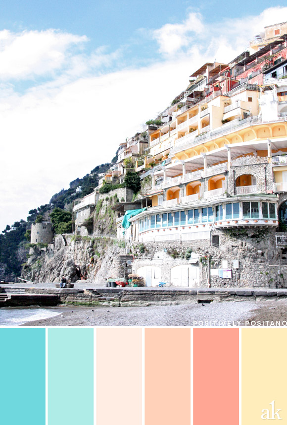
a Positano-inspired color palette
 [pinit]
My brain is officially on summer vacation because I forgot to post this last week!
When I was studying abroad in Bologna, a friend came to visit from Paris and I still remember this comment she made: "Italy is so...colorful!" And indeed it is! Looking at this photo I wonder if neighbors coordinated with each other to create their hillside palette. :)
Happy Thursday (pretending it's last Friday)!
[hr]
AQUA #6FD8DE / LIGHT AQUA #AFECE7 / LIGHT PEACHY-PINK #FFEDE3
PEACH #FFD1B9 / CORAL-PEACH #FFA694 / PALE YELLOW #FFEDBB
[hr]
Positano, Amalfi Coast, Italy