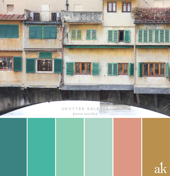
a shutter-inspired color palette
 [pinit]
If you've been to Tuscany, you're well aware of one of its architectural signatures :: green shutters. They're everywhere. Until today, I assumed this was simply a tradition in which Italians took pride, but according to Tuscan Traveler, it goes well beyond that.
...Under the code of the Belle Arti...All buildings inside the now mostly absent 16th century walls of the city are deemed to be historical. Shutters in Florence and Tuscany, as well as some other regions in Italy, can only be dark brown, black, dark gray or dark green. Any other color or lighter shade of one of the allowed hues is deemed out of compliance. A homeowner can expect a registered letter in the mail demanding change on threat of a substantial fine.
Fascinating! I have nothing but love and admiration for the artistic contributions of Italy, but the Belle Arti sounds like a national HOA. I wonder how Italians feel about this...
Anyway, here's your color inspiration for the week :: from "legal" dark green to "anarchist" faded mint, I offer The Shutters of Florence. Happy Weekend!
[hr]
BLUE-GREEN #3B8382 / TEAL #47B6A3 / MINT #8CCEB3
LIGHT MINTY-BLUE #ADD6C8 / TERRACOTTA #DC9885 / GOLD #B9904E
[hr]
