an earthy-textile-inspired color palette
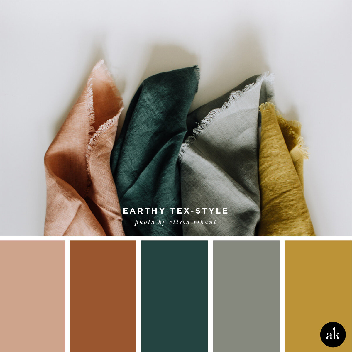
Ok, I know this palette is better suited for fall than February, but I was really inspired by this combination of terra cotta, spruce, gray (with a hint of green), and mustard yellow. The photo, taken in 2016 by Elissa Robinson, was part of a gorgeous holiday shoot she did for two wonderful shops: Bomisch and Spoon + Hook. Mmm…I’m ready to curl up into these colors and read a book!
CORAL CLAY #D2A08C / TERRA COTTA #9A562E / SPRUCE #244440
GRAY WITH GREEN #86897E / MUSTARD YELLOW #BB9337
WHAT ARE THESE COLOR CODES? The “hex codes” above are provided as a courtesy for those customizing website colors or looking for general color inspiration. They are not based on paint or Pantone chips. Remember that ink on paper will never look the same as light on a screen. If you like a combination you see, we recommend saving the image and heading to your local hardware store to find paint chips that match. Digital colors will change depending on your phone/tablet/computer screen, so be sure to color match with real swatches. Also, I make up all the color names.
Happy Friday!